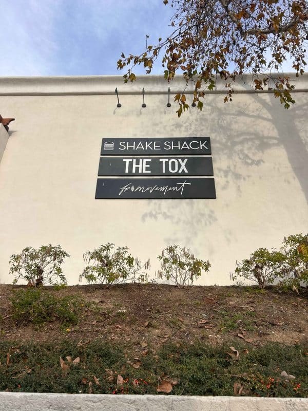
A matte acrylic tenant logo looks like one piece on the panel. It’s actually about a dozen decisions stacked on top of each other: thickness, finish, color, dimensions, font fidelity, panel sizing, mount method, adhesive choice, install access, and a few more that only show up once a crew is standing in front of the wall. North Coast Signs is based in Vista, serves Carlsbad, and just walked a new THE TOX franchisee through every one of those decisions on a wordmark now mounted above their storefront. The build is worth tracing from spec to mount, since the answer to whether local custom sign companies handle this work lives inside the choices most buyers never see.
The Spec Phase Is Where the Logo Gets Built
Long before acrylic gets cut, the spec sheet locks in choices that determine how the logo ages, reads, and bonds. Substrate thickness affects flex during install and warp resistance under temperature swings. Finish type changes how the logo reads under fluorescent corridor light versus direct sun. Dimensional ratios decide whether the wordmark sits centered on the existing tenant panel or crowds the edges. A shop that rushes the spec phase has already lost the install, even if the install crew is competent.
Quarter-Inch White Acrylic With a Matte Finish
The substrate on this build is quarter-inch thick white acrylic, chosen because thinner stock flexes during the press onto VHB tape and thicker stock fights the bond on textured panels. The matte finish was selected over gloss because gloss surfaces throw reflection back at anyone reading the sign during midday hours, and the THE TOX panel sits in a position that catches direct sun for part of the afternoon. White as the base color reads cleanly against the existing dark tenant panel from across a parking lot. Each of those calls happened during spec, not at the cutting bench.
Kenzo Font Sized to the Existing Panel
The wordmark is 68.80 inches wide and 18 inches tall, set in the brand’s Kenzo typeface. We sized the logo to sit centered on the existing 120 by 24-inch tenant panel with intentional negative space around all four edges. Logos that crowd panel edges read as anxious. Logos that respect panel proportions read as designed.
VHB Was the Mount Method, and Here’s Why
The franchisee inherited the existing tenant panel along with the lease, and most landlord agreements prohibit drilling into property the tenant doesn’t own. VHB tape lets the wordmark adhere to the panel face without modifying the panel itself, and the adhesive comes off cleanly at lease end without leaving residue or requiring panel replacement. The choice protected the franchisee’s lease deposit while still putting the wordmark in the air where it needed to be. Mechanical fasteners would have triggered a landlord dispute the franchisee couldn’t afford on opening week.
What Got Mounted Above the Storefront
The finished wordmark sits centered on the existing tenant panel, matte white acrylic on a dark backer, with negative space framing all four sides at proportions a designer would recognize. From the parking lot it reads as architectural. From two feet away it reads as cleanly cut, edge-finished, and bonded flat against the panel face. The franchisee opened with a wordmark that does the visual work it was specified to do.
See the Decisions Before You Sign the Quote
A matte acrylic tenant logo lives on a panel for the length of a lease, and the dozen decisions behind it determine whether the install holds or peels. If your Carlsbad storefront has a tenant panel and a brand logo that needs every decision walked through before fabrication, call North Coast Signs at (760) 536-5454 and we’ll spec the build with you in the room.


Leave a Reply