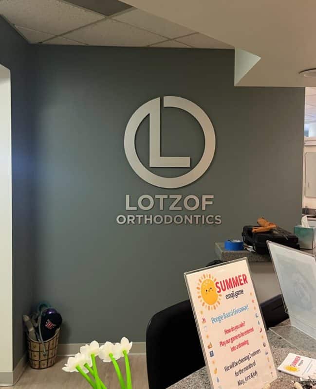
The orthodontist came in knowing he wanted dimensional signage but unsure about specs, so we walked through the decisions that separate signs that last from ones that fail. Here’s what we discussed and why each choice mattered for a thirty-five by forty-two-inch lobby sign with a thirty-inch circular logo element.
Substrate Thickness: Why We Spec Three-Eighths
The first question was substrate thickness. Most suppliers quote quarter-inch black acrylic by default because it costs less, but quarter-inch flexes under vertical load across spans wider than twenty-four inches. We spec three-eighths for anything over thirty inches wide because the extra rigidity prevents bowing when HVAC temperature swings cause expansion and contraction cycles. A thicker substrate also doesn’t telegraph the wall texture the way thin material does when you’re mounting to textured drywall. The cost difference runs about thirty percent more, but you eliminate callback risk from warping.
Face Material: Real Laminate Versus Vinyl Imitation
The next decision was the face material. Brushed aluminum laminate costs roughly double what metallic vinyl costs, so we explained the difference. Vinyl oxidizes under UV exposure from windows, shows every fingerprint when patients touch it, and fades unevenly under the mix of natural and artificial light that hits lobby walls. Brushed aluminum laminate is actual metal bonded to the substrate, so it scatters light consistently, resists cleaning chemical exposure, and holds color permanently. In medical lobbies where patients sit for twenty minutes staring at walls, material quality shows. We recommended laminate.
Mounting Method: When To Use Spacers
The thirty-inch diameter logo element needed a mounting strategy. Flush mounting everything keeps hardware costs down, but eliminates the dimensional effect you’re paying for. We mounted the logo with half-inch spacers to create shadow and visual separation, while the five-inch name text and three-inch supporting lettering beneath go flush because text doesn’t need depth to read clearly. Spacers also allow airflow behind the logo, which prevents moisture accumulation against the wall that can cause staining on porous surfaces. Mixed mounting creates hierarchy without overdoing depth.
Installation Hardware: Why We Provide Drill Patterns
Stud placement on circular elements requires precision because even two degrees off center becomes visible when someone sits directly across from the sign. We provide drill patterns, pre-measured studs, and spacers because field measuring on a thirty-inch circle introduces error that cracks acrylic during installation or creates visible misalignment. The orthodontist asked if installers could just measure on-site, and the answer is they could, but callbacks from cracked substrate or crooked logos cost more than providing proper templates up front.
Sizing Logic: Wall Coverage Without Dominance
The final discussion was on dimensions. The orthodontist initially wanted larger, thinking bigger conveyed more authority. We sized this at thirty-five wide by forty-two tall based on the lobby wall width and viewing distance from the waiting area seating. Larger would have required furniture rearrangement and made the space feel unbalanced. The five-inch name lettering stays readable from fifteen feet, while the three-inch supporting text handles tagline information without competing. We size based on sight lines and wall proportions, not preference.
Build It Once
North Coast Signs is based in Vista, and we spec lobby signage for Carlsbad orthodontists based on what survives daily patient scrutiny without warping, fading, or requiring replacement within five years. Call us at (760) 536-5454 to walk through substrate, laminate, and mounting decisions that matter.
Leave a Reply